Case Study

NC HealthConnex Integration

Bridging Health Records with User-Centric Design

Overview

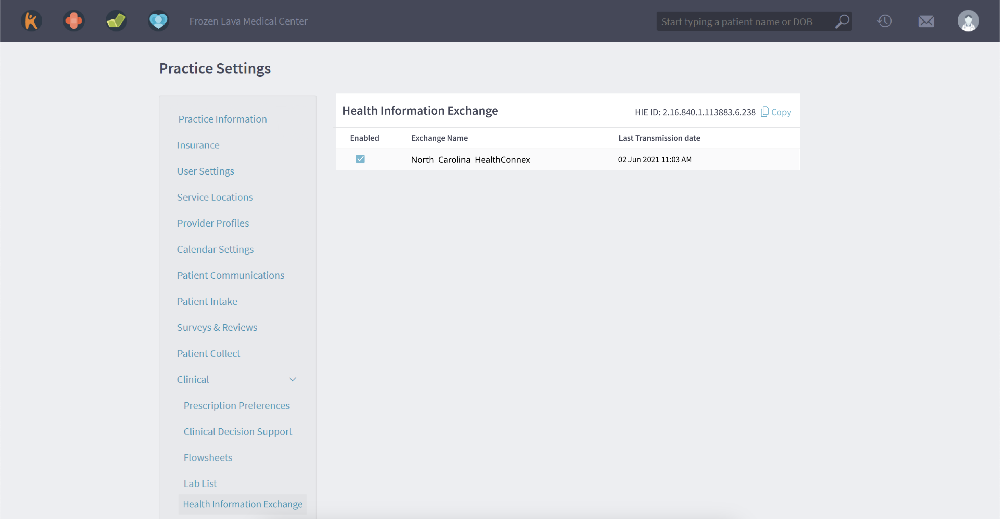
NC HealthConnex is an intermediary company facilitating the exchange of Patient Health Information between Kareo Patient Electronic Health Records (EHR) and the North Carolina Government. This case study delves into the UX design process for this vital interface, ensuring the seamless and secure transmission of data.

Objective

The core objective of this UX design endeavor was to devise an experience that allows easy management of the connection between Kareo EHR and the NC Government, particularly for practices supporting Medicaid, while ensuring data integrity, transparency, and user-friendliness.

Research and Analysis

User Research: Identified key personas critical to the process – System Admin, Provider, and Practice Manager – all of whom play pivotal roles in health practice operations. Through this lens, the primary user needs, workflows, and challenges were deciphered.

Design and Iteration

Information Architecture and Prototype: Based on the insights from Kareo Design Toolkit and inspired by pre-existing pages, an intuitive information architecture was laid out. This prioritized features like listing future exchanges and presented a table-format layout for clarity and scalability.

Prototyping and Testing

Interactive Prototypes: Using the crafted designs, an interactive prototype was realized. This prototype was subsequently showcased to various stakeholders, from the UX Team to Support Team Members, for garnering feedback.

Usability Testing: Post prototype feedback, certain design elements like the Transmission Error display were re-evaluated and altered. The evolving design was regularly stress-tested for usability, efficiency, and overall satisfaction.

Results

The UX design venture for NC HealthConnex led to several affirmative takeaways:

Optimized User Experience:
By focusing on user-centricity, a system was sculpted that resonated with the primary personas and simplified their operational demands.

Clarity and Efficiency:
Transparent workflows and clear categorizations, such as the selection of the Clinical category, ensured easy data management and minimal errors.

Anticipative Design:
The layout not only served current needs but was also forward-thinking. Considerations were already made for functionalities like search as the platform scales.

Conclusion

The UX design journey for NC HealthConnex fostered an interface that seamlessly bridges Kareo EHR and the North Carolina Government. Through deep understanding of user requirements, iterative designs, and proactive approaches, the platform assures easy, transparent, and secure health data exchanges.